École Les Gobelins
ux/ui design
◉◉◉The main challenge was to reorganize the massive catalog of training and formations, and make them easy to find for the relevant users. After defining new parent categories with people from the school, we started to design the website as an e-commerce one. The user can navigate from categories matching with his profil, visualize product-formation page, and create a basket of his favorite ones. It's now much more quick and easy to find what you're looking for, to compare selection if needed, and to get in touch with the school's secretary to ask your questions or an application form.
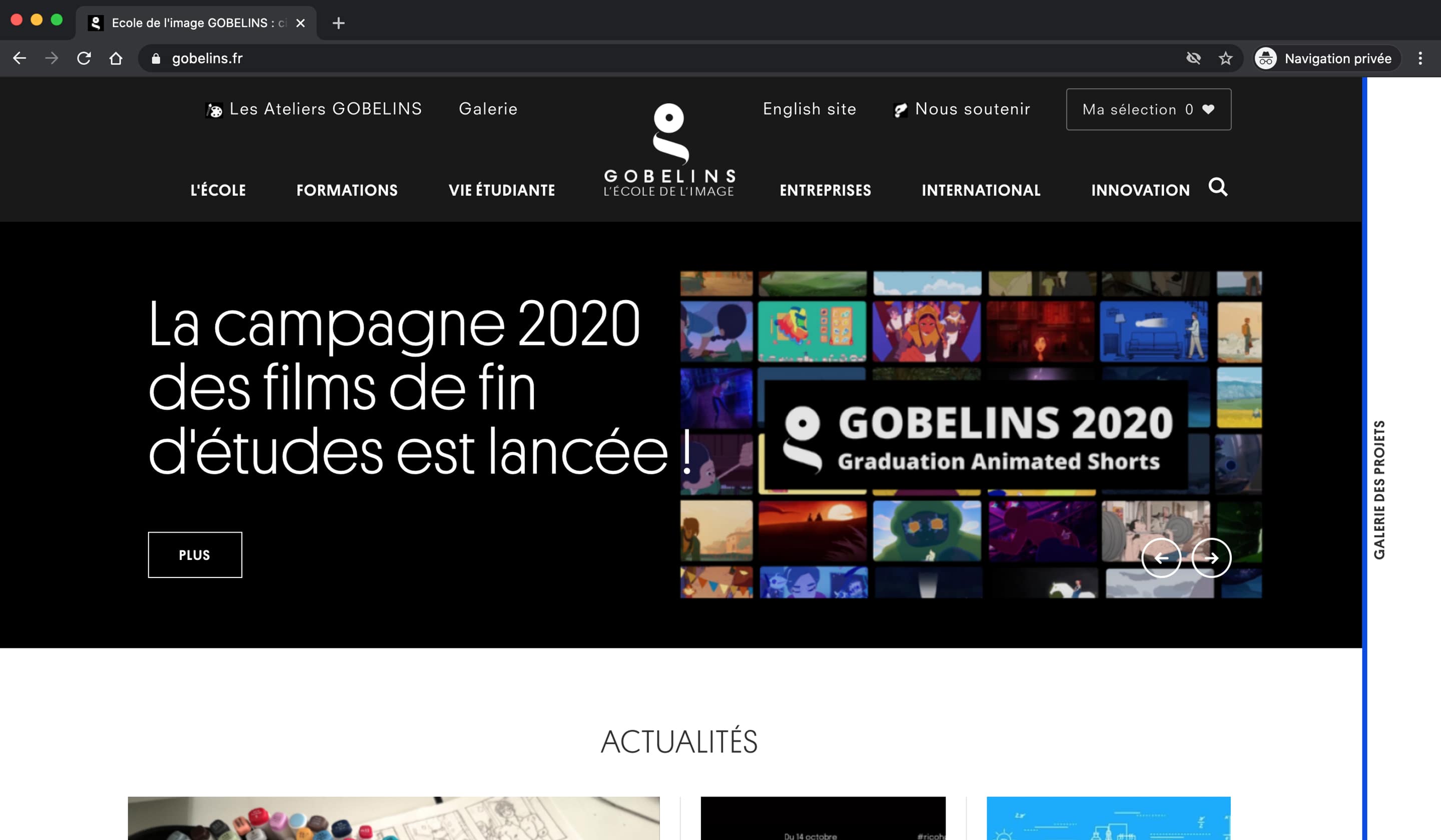
◉◉◉ Home page
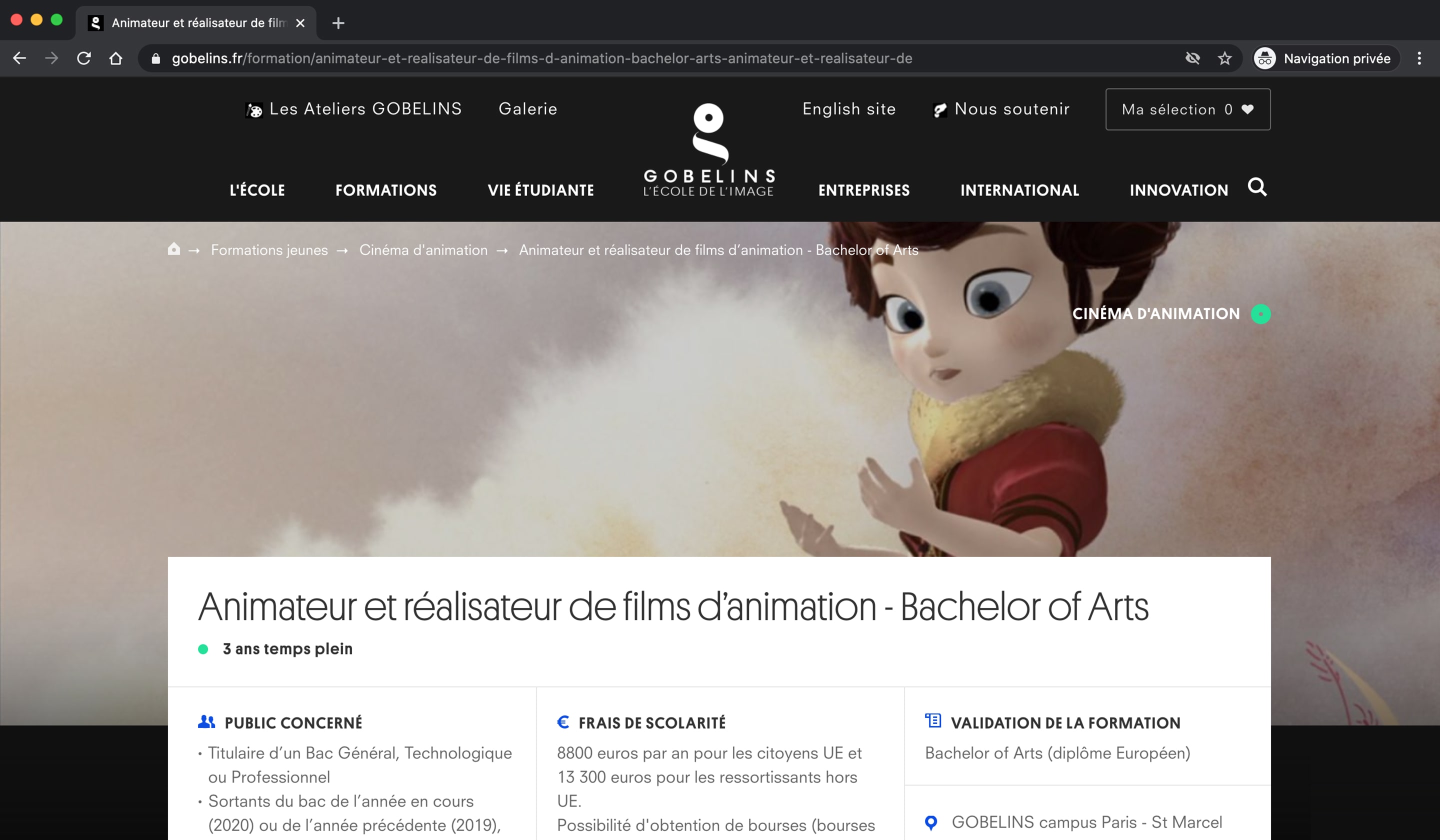
 "Product" page
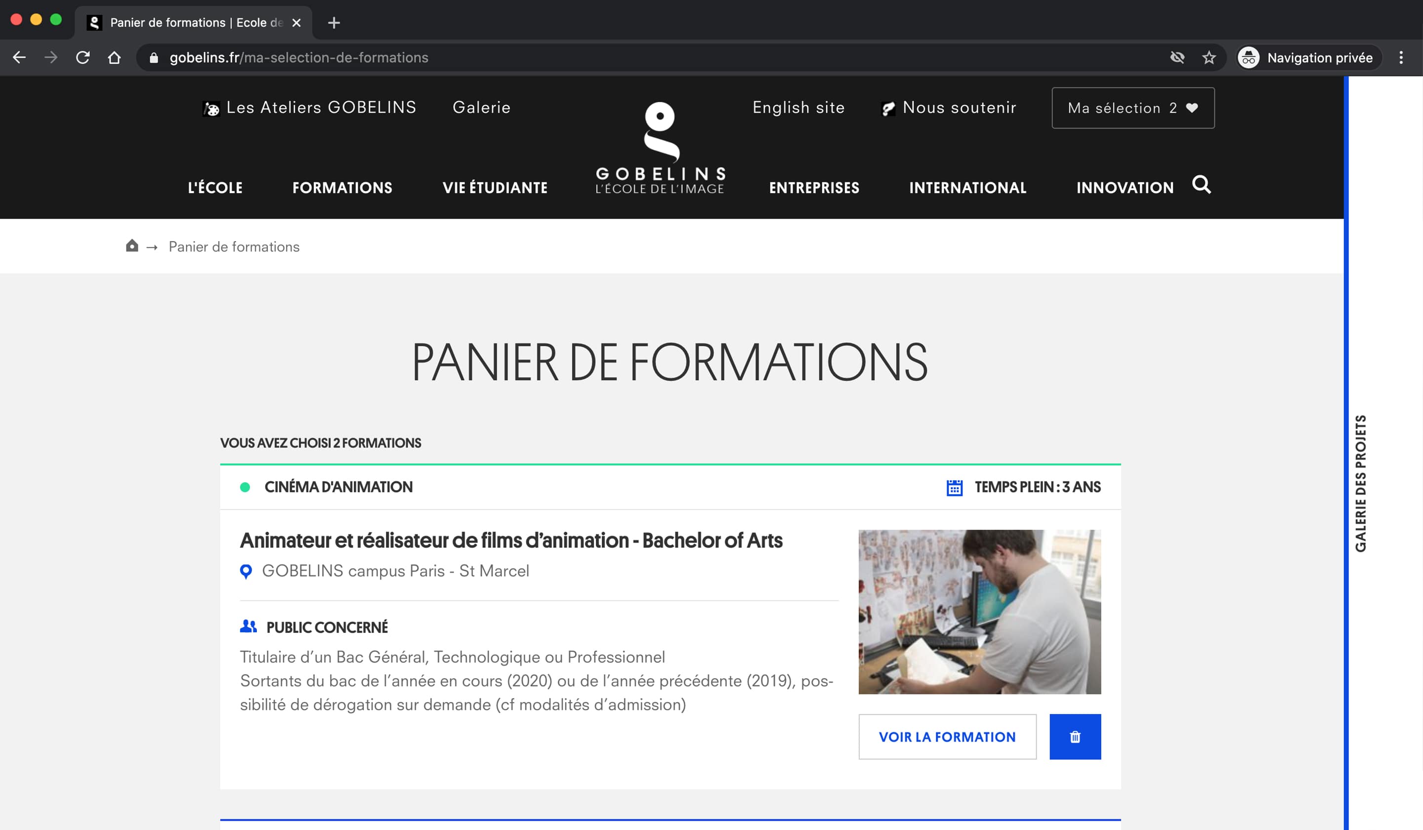
 Basket