EKO by Crédit Agricole
ux/ui design . change management
❖❖❖The project EKO was already started when I joined it. Some screens have been designed and the developers were producing the back office. But the team in charge was not moving forward anymore. People from CA were only focused on their own goal, metier related. The previous design team was isolated and untrusted. So the first step was to get everyone onboard once again. Not for starting back from scratch because there was no time for that, but to understand what each one needed to see happen. So we set up double weekly meetings to design together piece by piece what rest to be done and work closer with the developers. The plateforme was finalized in time with a full engagement of the team.
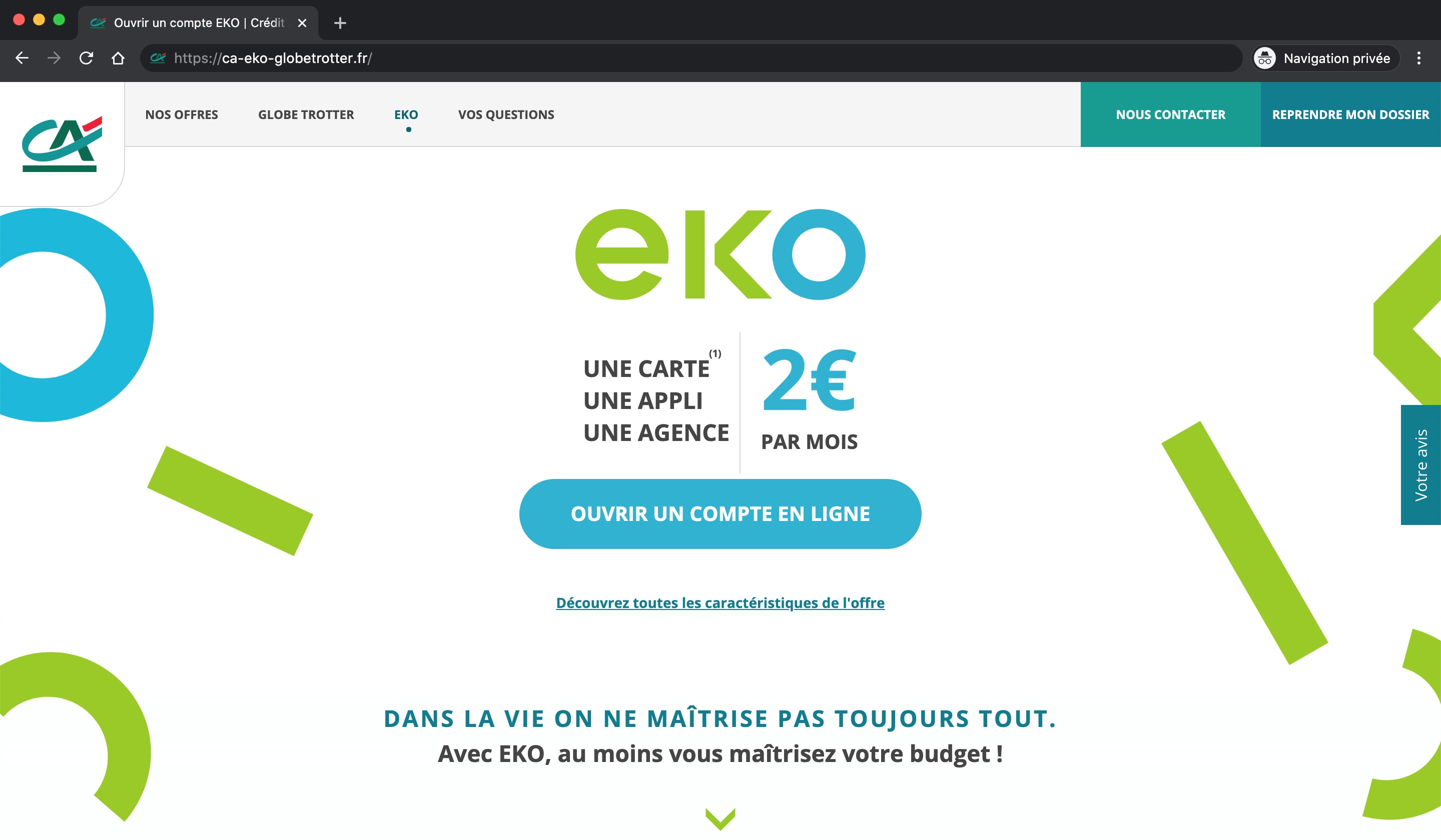
❖❖❖ Homepage
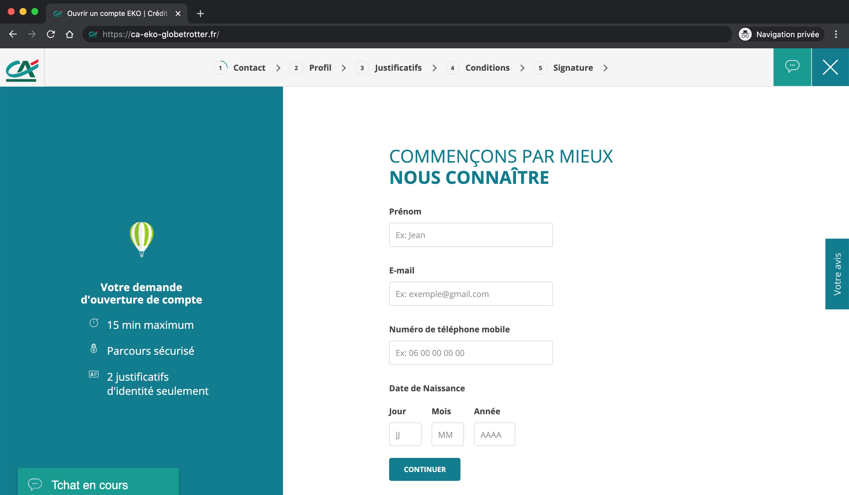
 Subscription tunnel
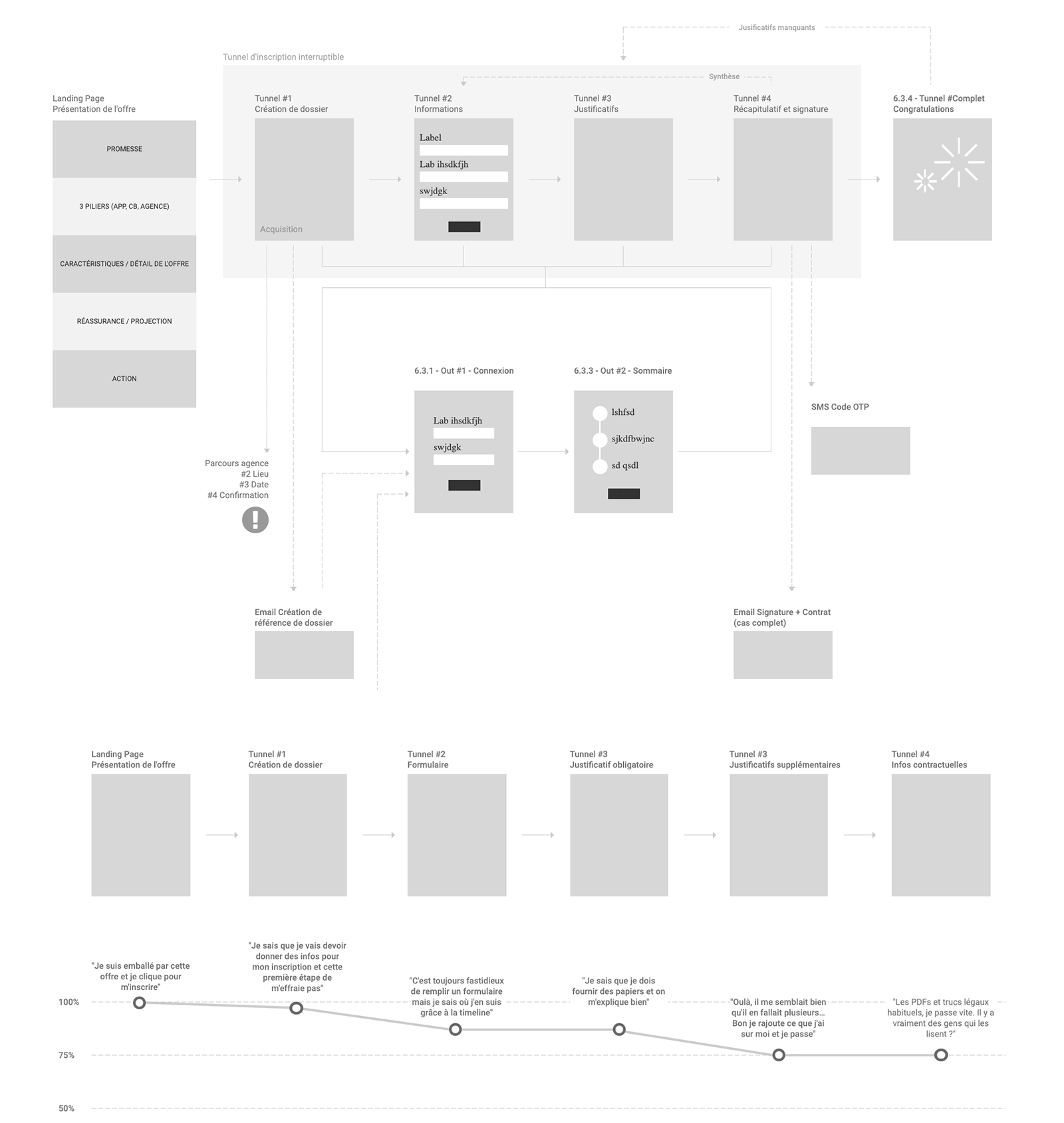
 User path & emotionnal timeline